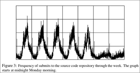
A recent paper by Rob Pike on a new system for automating analysis of very large data sets (using their new language, Sawzall) included a graph that I thought was kind of cool. It showed a histogram of commits to the Google source code repository by minute of the week:

There is some obvious structure: Weekdays are busy, weekends less so. There's definitely a dip around lunchtime and Friday is the least “productive” day of the week, if you measure productivity by code commits. There is a spike just after midnight every day—maybe some automatic process is committing code? Auto-syncing of repositories?
I became curious about the idea of repository visualization. I was curious to see the histogram for the Evolution Robotics repository, so I wrote some code to do some very simple analysis of a cvs log. I actually executed “cvs log” on the top directory and counted every line that looked like this as a commit:
date: 2005/06/01 17:23:59; author: cody; [extra stuff I ignored]
I can't show you the result of that analysis because the repository isn't public. I won't show you the code because it's ugly. So what's left?
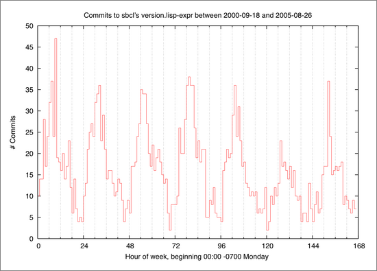
I can run the same code on SBCL's repository at SourceForge. Based on advice from SBCL developers on #lisp, I ran cvs log on the file version.lisp-expr instead of the top level sbcl directory, to more closely approximate measuring something like significant commits. Here's the resulting SBCL histogram:

SBCL commit histogram, by hour of the week. Rendered by gnuplot. Click for the PDF version.
I was a little surprised that the valleys in SBCL activity correspond pretty closely to midnight California time. The valleys are, however, much narrower than the ones I observed in the histogram associated with a repository mostly worked on by full-time employeees who all live in the same time zone (and they seem narrower than the google valleys, too).
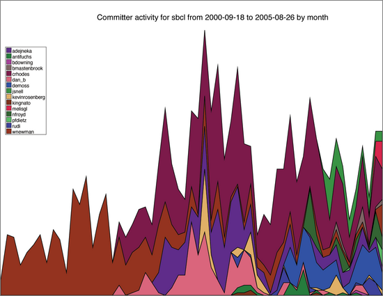
Next I became interested in seeing the relative activity of the various committers to a repository. I wrote some code to keep track of the number of commits made each month by anyone who ever made a commit. I wrote more code that used CL-PDF (with Zach Beane's patches) to generate charts in the style used by babynamewizard.com's Name Voyager Java applet, which is a pretty nice way to visualize the relative popularity of various baby names over the past 120 years using census data. In my version, each committer gets a band of color whose vertical thickness at any given point on the X axis is proportional to the number of commits made by that person in that month.

SBCL committer trends, by month. Rendered by CL-PDF. Click for the PDF version.
The colors are chosen at random, so it can be a little hard to distinguish one person from another, but it's clear that for about the first 16 months or so wnewman was the sole committer, until he was joined by crhodes and dan_b. About six months after that, adejneka starts making commits.
One feature I half-expected to see in these trend charts was a wide range of committer “productivity”, perhaps even spotting one of the legendary superhackers who makes 10 (100!) times as many commits as the rest of the team. I think there are enough damping factors to keep the ratios from getting that crazy; There were, however, some people who were consistently two to three times as active as the rest of the developers. And from working with them, I know they actually were at least that much more productive than other programmers and the disparity wasn't just an artifact.
I would be hesitant to look at these charts for anything more than entertainment, though one might imagine that something like this would be included in a kind of anthropological analysis of software development. Or Taylorism.
Fun fact: The highest resolution version of these charts, the vector-based PDFs, are much smaller files than the high resolution PNGs I created as an intermediate step, which were much smaller than the low-res JPEGs I was originally going to post (but found lacking in quality) as well as the low-res PNGs you see here.
Posted by jjwiseman at August 27, 2005 02:34 AMOn a slightly related note:
My company implemented CVS hooks to tie code checkins to bugzilla bug entries. This then allowed us to do reverse lookups on the code base that tie bug fixes to files & packages.
We track which files & packages are hot spots for bug fixes. The hot spot usually indicates a design flaw. This also gives a valuable head check on intuition of where problems exist.
Posted by: on August 31, 2005 05:02 AMI happened to be at a talk he gave a few weeks ago and he said he thought that spike was some sort of automated process that touches a lot of the repository (some sort of reporting tool maybe?), but that he didn't know where it came from. The cooler visualization that doesn't come out in the paper was this video he made of search frequency throughout the course of the day---he picked that Northeastern power outage a couple of years back to see what it looked like. Very cool. :-)
Posted by: Byron on August 31, 2005 01:42 PMI did this once at my current work-place in an effort to understand and expose the development process of product that, at the time, was brand new in terms of technology. The intent was to use historical metrics to add supporting data to the planning process of a new product line.
I used anecdotal information from a company long-timer to classify the check-ins and relate them to major milestones in the project.
From that, I also correlated the check-ins related to feature-creep; i.e., features not in the schedule. I was shocked to see about a 9 to 1 ratio of unplanned features to planned features.
Other interesting tidbits included the heavy, heavy back-end loading of commits. Real activity didn't begin until prototypes were available. Of course, this seems obvious to someone who works with software/hardware products, but it came as a suprise the the planners.
I eventually used this data in determining the schedule of another project. I used it to argue that it was dubious to precisely define a 2 year schedule without addressing this institutional feature-creep and asymmetric work load. I proposed that we adopt a more agile approach, but lost that battle.
Instead, we wound up adding a huge fudge factor to account for these unknowns.
The StatCVS project at SourceForge (http://statcvs.sf.net) can also generate similar graphs of commit distributions. I don't see this feature listed, so maybe it's in the latest CVS tarball?
~Matt
Posted by: Matt Doar on September 5, 2005 04:11 AMPersonally, I commit fewer checkins on Fridays because I don't want to break the build for the entire weekend!
Posted by: Chris on September 5, 2005 04:58 AMChris, wouldn't that mean you do *more* but *smaller* commits on Fridays?
Posted by: Lasse on September 5, 2005 05:15 PMDon't miss http://statcvs-xml.berlios.de - it provides more fancy charts than statcvs does.
Posted by: Dave on September 7, 2005 02:08 PMHmm. So.. I guess you sent the other results via e-mail or is my memory corrupted or both?
Posted by: cody on October 5, 2005 03:38 PMRight, Cody. Evolution people got to see the results from the Evo repository.